Client Information
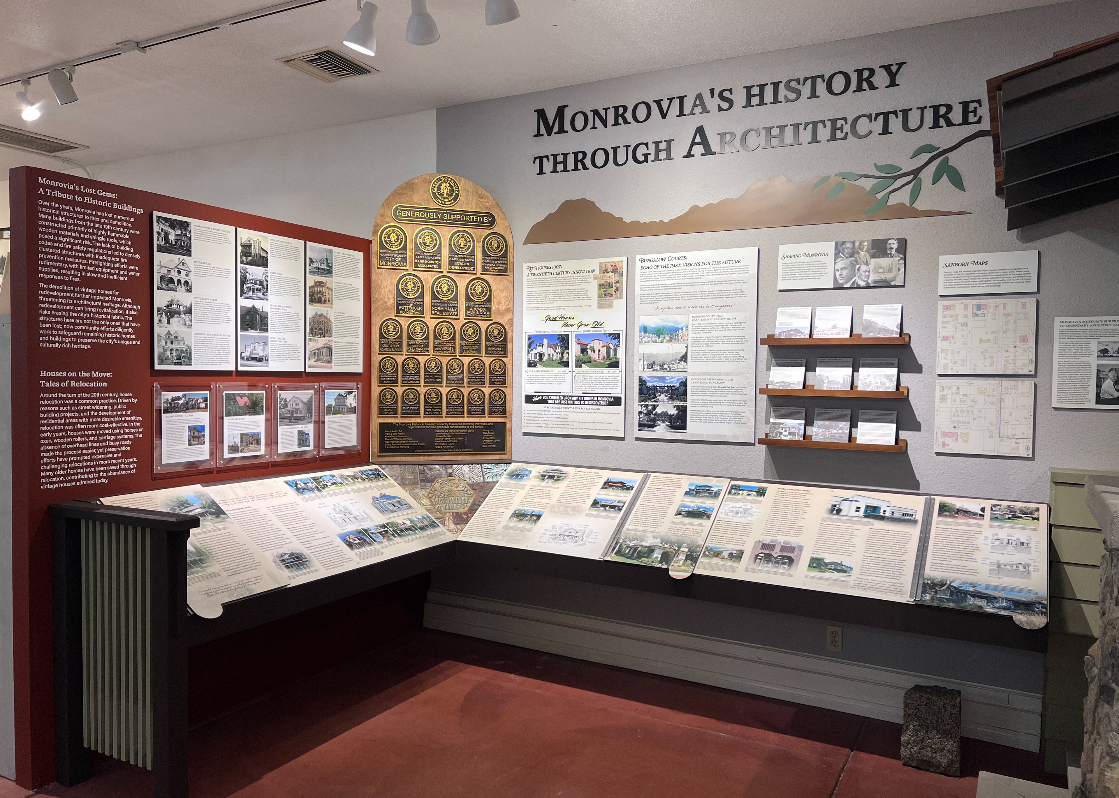
The Monrovia Historical Museum features many exhibits that tell the history of the city. Working together with the exhibit curator, I designed an interactive flip book and soffit letters for the museum’s newest Diversity Exhibit that was unveiled for their 30th anniversary.
The grounds to the museum used to be “The Plunge”, which was a swimming pool that served the community for many decades until its closure. The idea to incorporate colors and textures that resembled water was to not only pay homage to the museum’s roots, but also metaphorically guides the readers as the waves ebbed and flowed through the course of history.
Design Process
My main roles for the exhibit were to typeset, design and create the layout for the timeline piece, along with the dimensional soffit letters. I was originally given a rough draft by the exhibit curator (as shown below), but I had the creative freedom to choose the fonts, textures, and pattern. The poster and timeline structures were designed by our production manager.
The posters above the timeline were originally intended to have the same color palette, and so I was asked to match the colors for consistency. Although the designer decided to change the colors for each poster, it ultimately allowed the timeline to stand out on its own.
Inspiration draft created by the museum's board members
Exhibit space
Initial timeline draft
Pattern, Texture & Typography
When researching the history of The Plunge, I envisioned a time of peace and tranquility, a place where the community went to enjoy themselves. Thus, this wave pattern was chosen as it has a consistent flow, but at a seemingly slow pace. The solid waves provides contrast and a base for the texture. Different hues of the background color were chosen for the fill to mimic the many shades of the ocean.
For the texture, I sorted through many stock assets of ocean waves and experimented with a few by extracting different elements through Photoshop.
The typography was kept simple for readability, with all sans-serif fonts to maintain a modernized design.
Top: Base Panel Bottom: Individual Pages (2, 3, 4, 5)
Soffit Letters
